Website and Light Branding
Tenax Contracting • 2026 • Contracted design work
Brand identity and website for a South Dakota contracting company, including logo design, color and type system, and a services-focused site with mockups for signage and vehicle branding.
Deliverables
Brand identity, website, signage mockups
Primary challenge
Legibility across scale, from card to truck
Context
Ground-up launch for an independent trades business
In this case study
- 1. Problem
- 2. What we did
- 3. Outcome
Problem
Tenax Contracting needed a modern website and brand identity to better represent their South Dakota-based contracting business. The challenge was to create a cohesive visual system that would work across all digital and print materials while maintaining the company's professional image and local presence.
What we did
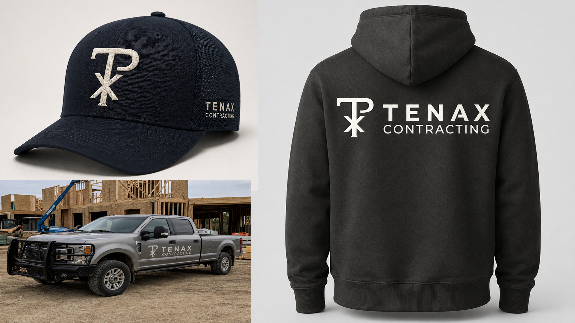
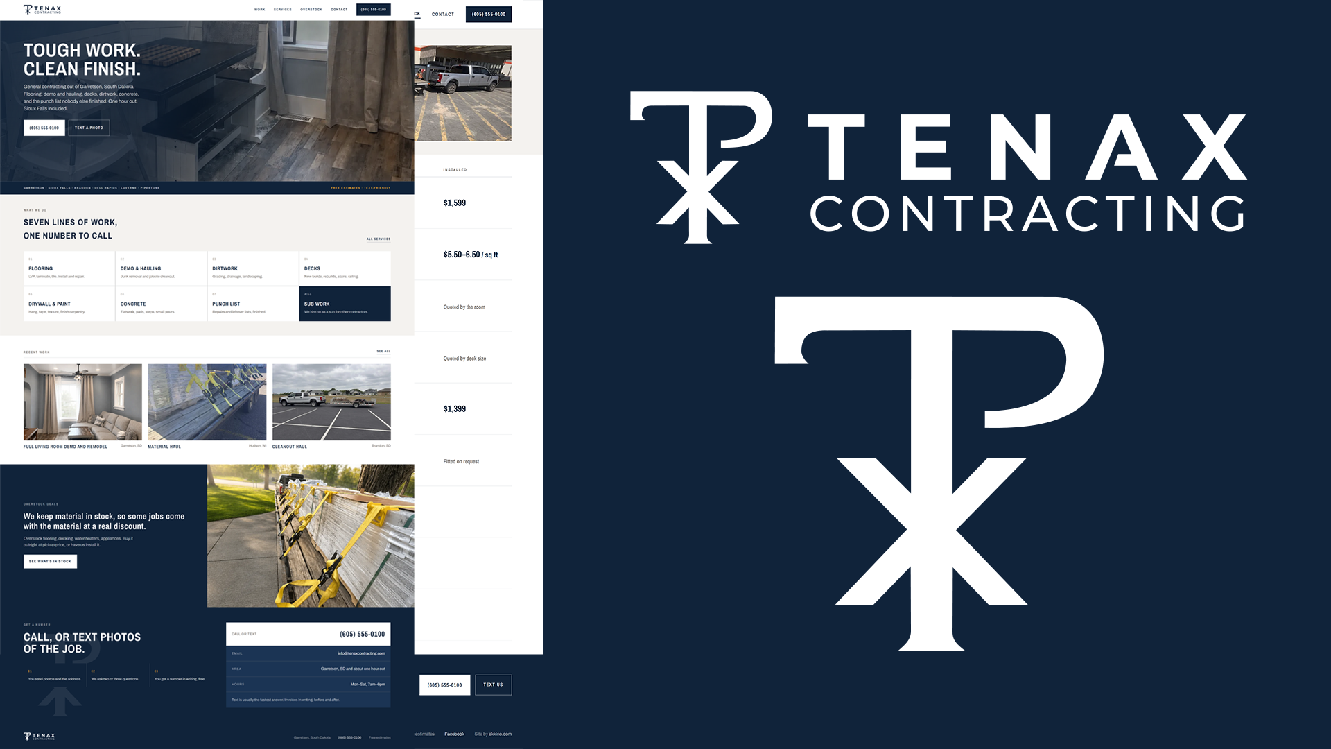
- The engagement started with the name and worked outward. Tenax is Latin for tenacious, holding fast, and the mark had to carry that without leaning on the visual clichés the trades default to. We built a monogram that reads as a T and a P locked together, drawn with the weight and proportion of a stamped maker's mark rather than a decal. The form holds at the size of a business card and at the size of a truck door, which is a harder constraint than it sounds and the one most contractor logos fail.
- From there we developed the supporting system: a restrained palette anchored in deep navy and near-black, typography set wide and confident, and a full set of lockups covering horizontal, stacked, and standalone-mark configurations. Each was tested against the surfaces the brand actually lives on, so we produced mockups for vehicle signage, yard signs, and job-site presence to confirm the mark read correctly at distance and in poor light before anything went to print.
- The website was built to do one job well. A homeowner searching for a contractor is making a trust decision in under thirty seconds, so the site leads with completed work, states the service area plainly, and puts contact within reach from any point on the page. Structure and copy were written for local search rather than for a portfolio audience, because the traffic that matters here comes from someone two towns over with a problem and a phone in their hand.
Outcome
The client launched with a complete identity system and a live site built to convert local search traffic, rather than the piecemeal setup most independent contractors start with. The mark works consistently from favicon to vehicle signage, the site communicates capability without overstating credentials, and the whole system is positioned to grow as licensing and service offerings expand. The result is a new operation that looks established from day one.
Screens / visuals